For confidentiality reasons, I have omitted or obfuscated restricted information. All information in this case study is my own and does not necessarily reflect the views of DeviantArt. While I can't share certain details of the research and deliverables, I can elaborate about my process and the general project scope.
PRODUCT DESIGN
CORE
CORE
membership
Boosting Premium Membership Conversion Rate through Strategic UX/UI Design Changes
YEAR
2022
ROLE
Research
UX/UI Design
Branding and Typography


Overview
CORE is DeviantArt's premium membership. Traditionally, the main reason for joining was to help and support the platform and the community within it. In recent years, new monetization tools have been introduced to attract high-intent creators to join Core and offer their fans exclusive paid content.
The differences between these two motivations for joining the premium membership presents opportunities to improve related funnels and entry points and to creating new ones moving forward.


01
COREspondent
02
The CORE values
Goals
Core Membership is a cross platform product. As so, it has to be prominent enough to catch the eye and at the same time to smoothly blend in with users' flows. It also should cover enough use cases with smart adjustable components to be use by various teams.
Increasing number of new CORE members joining, and re-introduced it to the existing community.
Reducing churn rate by identify high intent users both as revenue-generating creators and community supporters.
Improving visibility and discoverability of CORE as a brand to attract users and highlight the benefits.
Start the Journey...
CHALLENGE
In 2021, DeviantArt Launched the new Subscriptions product, which enables active artists to offer their fans an ongoing exclusive content via a monthly subscription.
Until then monetization products on the platform were free to use by any registered user. While a fee was deducted from the earnings of free users, Core members paid nothing. This model attracted many artists offering one-time products but hasn't created the necessary commitment needed for ongoing sales.
Furthermore, the obscurity and lack of entry points to CORE's purchase flow needed to be addressed.
"Create a tier" behind paywall based on previous pattens
04
Just a little bit of COREage
PRODUCT MAIN ENTRY POINT
Subscriptions product was offered free for a limited time, which allowed us to collect data and examine each step with A/b tests and compare it to the other monetization products.
The first and probably the most important step in any flow is to increase the number of users entering; Even better if they are high intent users - who are interested and most likely to use the product.
This was accomplished by emphasizing the product's intent with one prominent button with a clear CTA and a content expressing the benefits of the product. Also, by minimizing CORE presence (and placing the CTA in a tooltip), more users felt welcomed and started creating a tier.
Though the entry rate to Core's pricing page dropped slightly at this step, it has increased throughout the overall flow.
New "Create a tier" behind paywall


"CREATE A NEW" DIALOGUE
After the changes in the Create Items, more users started entering the create dialog modal and interacting with the products. For Subscriptions׳ "create a tier" dialog, I needed to revisit other dialogs modals in use and optimize the patterns and guidelines to match the paywall state of Subscriptions.
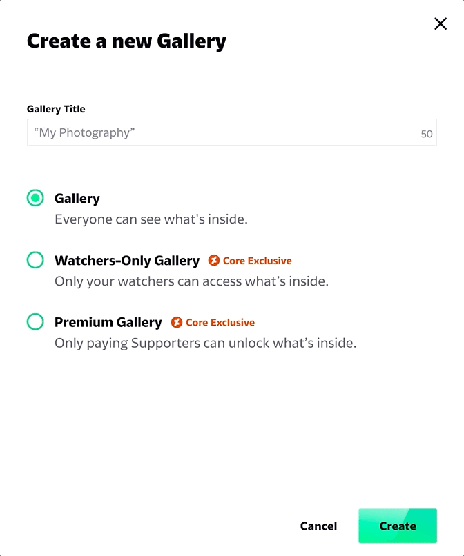
In the "create a gallery" dialog modal, where one option is open to all and the others are disabled for free users. The radio button's disabled state implying exclusiveness and inaction for the user. The secondary "upgrade" link button has a weak CTA and low visibility.
By allowing users to select the premium options and directing them toward a prominent and clear CTA, not only more users clicked on the upgrade button but more of them converted and joined the CORE membership.
Previous "Create a new Gallery" modal

"Create a new Gallery" modal based on new pattens
"CREATE NEW TIER" DIALOGUE
After optimizing the upgrade flow in existing products, and validating it with usability tests, I implemented the same pattern for subscriptions.
This UX pattern became a best practice on the platform, as according to data, not only it has the strongest entry point rate to CORE's pricing funnel, but also the highest conversion rate for premium upgrades.

Previous "Visitor Mode" - Owner profile page
05
Behind the COREtain
View the Benefit
CHALLENGE
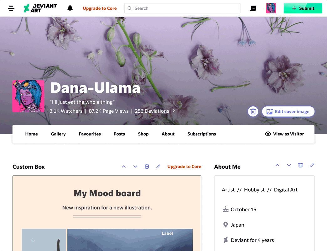
CORE's paywall is a also used in community oriented products, such as Custom Boxes - that allows users to create personalized sections on their profile page.
Though, It's a very popular product, a low percentage of users are upgrading their account to fully unlock custom box in order to make it visible to visitors on their profile.
Non-CORE users could view the custom box they created on their own profile, though it won't be visible for their visitors until upgrading to CORE. To discover how visitors sees the profile page from their side they had to click on "Visitor Mode".

New "Preview Mode" and paywall state for custom box
PREVIEW AND PAYWALL
The data indicates that the "Visitor Mode" is a rarely used feature. It appears that profile owners don't realize the custom boxes they created are hidden from other users, or they simply don't mind.
Instead, after creating a custom box, the draft will display with semi-transparence indicating it's not published and not visible to others. The content and CTA explain the status and invite users to upgrade, while CORE's assets support its discoverability and consistency.
Using the "Preview" button, users can view how the box will appear on their profile page. In the preview state, the box will be highlighted along with an additional CTA for upgrading in a bar that sticks to the top while scrolling.
A 17% increase in conversion rate was achieved by addressing custom box upgrade opportunities and highlighting required actions.
07
CORElation
DATA & BI
Conversion rate to CORE by entry points
Q3 2021
Q3 2022
12%
6%
4%
2%
8%
10%
Create Item
Create Dialogue
Success message
Paywall state
Edit/Preview state
+31%
Overall new CORE members
-24%
In churn rate
+44%
New CORE members via new entry points
07
COREctions
Worth Mentioning...
To support the functionality of the experience and flows and to meet the marketing requirements, I redesigned the UI and branding for the CORE Membership product. It was an essential process that increased the discoverability and contributed to the consistency of CORE across the platform.
Beside fixing the typography of CORE's logo, the Symbol was changed from the generic star to the DeviantArt logo and the main and secondary colors were adjusted to match accessibility guidelines.

Old CORE's logo and brand's colors

New CORE's logo and brand's colors
In order to clarify the functional differences of CORE's labels and tags, I have set the following guidelines:
To indicate any of CORE's features or products I used the round icon based on the new logo's symbol, which refer to the general premium product.
Old CORE's product indicator
New CORE's product indicator
User interviews revealed that CORE's status is important to the community, since every plan grants different privileges (like being a group admin or customizing profile). Therefore, Instead of the old round star icon, I designed new labels for each plan to emphasize the differences and hierarchy between them.

Old CORE's plans labels

New CORE's plans labels
An issue that brought up by the customer support team was regarding the membership's terms and conditions misunderstandings. Though relevant disclosers and messages were correctly placed in accordance to the limitations and benefits, they were easily missed and caused frustrations for both the users and the CS team. To support those cases, I designed a new component based on CORE's branding to highlight its content and context.

Old CORE's message & disclaimer

New CORE's message & disclaimer
During sale campaigns, the conversion rate of users joining to premium was almost doubled thanks to a new variant of CORE button; By adding discount labels and a festive micro-animation, we drew users' attention to the sale and attracted those with high intent to the pricing page.

Default Core branded button

Core branded button during sale
Final Thoughts
The core membership is integrated into all products DeviantArt has to offer. Besides expressing the value to its users, it also demonstrate the platform's relevancy as a contract between the two.
My role as the UX lead included not only designing the experience and the flow, but also updating the design of the brand, creating the UX pattern library, and continually looking for new and improved ways to increase the number of paying members.