For confidentiality reasons, I have omitted or obfuscated restricted information. All information in this case study is my own and does not necessarily reflect the views of Stav FJ. While I can't share certain details of the research and deliverables, I can elaborate about my process and the general project scope.
STAV
STAV
ONLINE STORE
fine jewelry
YEAR
2020
ROLE
Research
UX/UI Design

01
all that is gold
Overview
Stav Davidovich established her brand 'Stav Fine Jewelry' as an online business in order to bypass the heavy costs of retail models and retain more control over marketing and distribution. Despite initial success, the online store had been experiencing low customer satisfaction ratings, with many users complaining about the difficulty of navigating the website and the long checkout process, causing them to prefer to complete purchases by phone. In addition, there was an increased demand by clients to see and feel the jewelry in person.
The opening of Stav's first physical store presented an opportunity to refresh the online store guidelines and improve the shopping experience both offline and online. To address these issues and align with the brand's values of personal attention and credibility, I was offered the chance to lead this exciting project.

02
golden rules
Goals
The main objective of this project was to increase revenue by improving the online experience and resonating the quality of Stav's work through the online store:
Improve the experience on the website and mobile by enhancing usability and aesthetics to increase customer satisfaction and loyalty.
Design a digital presence that accurately reflects and effectively promotes the brand and its values.
Identify and address website issues that hinder sales, and explore ways to decrease costumer dependence on store contact.
03
a gold mine
Market Research
CREDIBILITY
QUALITY
VALUE
The research began by conducting a competitive analysis to understand where the brand fits the market with its competitors. Traditionally, the jewelry market is divided into two major classifications: well-known premium brands and independent jewelers and goldsmiths, but a lot has changed in recent years.
Together with a digital marketing specialist, we drew two main conclusions:
While big brands are losing their hold on the market due to a widespread increase in preferences and demand for fair, local, and personal shopping experiences, independent jewelers have to demonstrate knowledge, honesty, flexibility and high-quality production to compete in the market.
Thanks to exposure on social media and rising living standards, luxury jewelry has become an almost everyday fashion accessory and is reflected in a steep and consistent rise in sales of non-wedding or engagement jewelry
Data Analyzing
Analyzing the users online patterns on the website gave a deeper insight into the strengths and weaknesses of the current design. The ‘bounce rate’ for the homepage seemed noticeably higher than average, possibly because the information presented is only links to the different shopping categories without adding any extra value. Nevertheless, users that crossed to the shopping area prefer to do so from the ‘categories' box and not from the upper menu.
We also noticed a wide use of the 'Share' option in the product page, although the button doesn't stand out. It gave an indication for hesitation when making high-cost purchases and the need to consult about it.
04
the goose
‘Mobile first’ was the correctly chosen strategy, as more and more users preferred to access the website from their mobiles and due to the increasing entry points from social media ads.
In addition, a critical review of the current site worked as a heuristic evaluation by considering the main usability guidelines and by walking through the site steps in the shoes of a typical user.
It was essential to understand which issues should be addressed in the redesign and which elements should be preserved.
77%
of users access the website from mobile
21%
of users left after
visiting one page
63%
of sales were completed after contacting the studio
(usually by phone)
54%
of the purchased items were added to the wishlist first
05
golden eggs
Inferences
Based on the research and together with the owner and her staff, we defined the topics of how to improve the interface and experience in the website.
STORY TELLING
In this competitive market, the website should present the benefits of the brand. Clients are not buying just a product but the entire notion behind it and the way it refers to them.
VISUAL HIERARCHY & CLEARNESS
An easy and simple shopping process is the most important thing in an online shopping site. The design should inspire the customer and on the same time guide in a safe and reassuring way towards the check out.
TRUST BUILDING
Before sharing the payment details, clients want to know they can trust the jewellers experience and expertise. Social media, online ads and other communication forms can shape the interaction with the brand, but the website must fulfill the promise of trust.
Story Telling
Setting the right expression of your story makes the brand influential and fulfilling. Fixing a tone and impressively conveying the brand's values to your audience helps make your brand unique. By creating a visual narrative around the brand and the goods it sells, we can frame the passion behind the business, the way the clients see the brand and (as well as additional benefits) what it says about the them.
VISUAL APEARANCE
Before exploring the store design, I needed to update the visual identity of the brand. A self-named brand such as Stav, should show who she is as a designer and her motivation and knowledge. In addition to strengthening the personal connection, the brand needed to look fresh and contemporary presenting with a clear, fashionable visualization.
Instead of using a predefined color scheme, the color system will be determined by the seasonal collection's photoshoots. Adopting grayscale palette and relying on the environmental and inspirational collection's colors, creates an elegant, modern and sophisticated look. Refining the logo without damaging it, was a long prosses since the client was emotionally attached to it. It was important to adjust it to pixel perfect as well as making sure all icons that are being used are accurate. Using Bold and catchy typography as a key design element, took a central role in the current web design. typographic hierarchy and fonts are among the core tasks of every UI design project.
06
uncut diamonds

Heading 1 36px
Heading 2 18pt
Paragraph 1 14pt
Paragraph 2 12pt
+
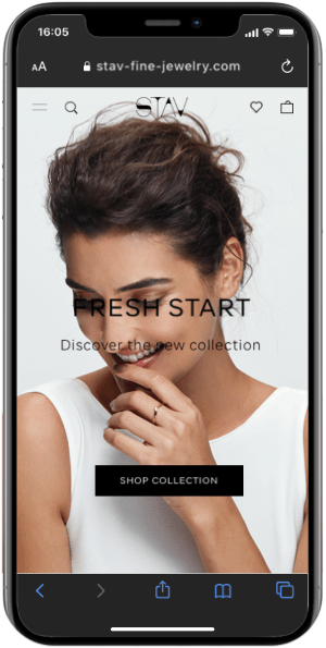
HOMEPAGE
The homepage's purpose is to encourage visitors to explore deeper into the site and ultimately, convert them into loyal customers. This is also an important opportunity to establish the brand values and in our case, to introduce them to the jewelry designers professionalism and personality.
To promote interaction, I replaced the categories boxes with a horizontal display and added boxes for relevant content and imagery accompanied by CTA buttons. It opens possibilities to guide visitors through the buying journey and encouraging them to explore the offerings as well as promoting products, offering professional information and getting to know the designer.
07
draw a bead on
Visual Hierarchy & Clearness
The ability to create a compelling story is through clarity and visual hierarchy. When components are structured wisely, visitors can navigate and interact with products without friction and effort, thus having an enjoyable experience. Hierarchy helps to create a focal point, gives the user an entry point and guides them to the most important information.
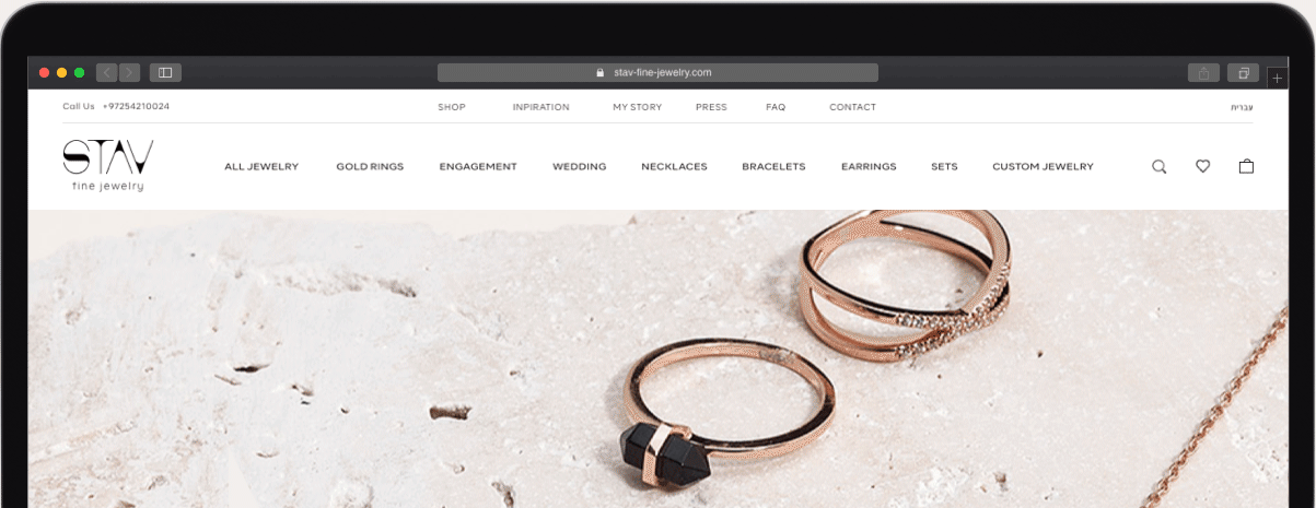
UPPER MENU
The requirements in the brief were very specific about the upper menu. To meet them in the desktop version, I divided the various components according to topics and usage and arranged them according to the importance of accessibility.
To save space, I moved the social-media icons to the footer based on the logic that customers originating from social media will then visit the store and not the other way around.
I designed it as a menu with two collapsing states - by hovering and by clicking, that allowing visitors to control the amount of information on the screen.
The upper-main menu that was busy and distracting is a critical element, so I adopted the approach of paying attention to clarity with simplicity being the goal.
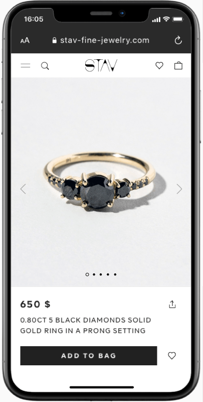
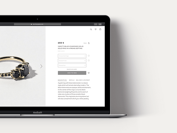
PODUCT PAGE
When a visitor enters the website, they should know what is on offer. They should be certain and confident about the product before hitting the ‘Pay’ button.
Rearranging the products' info into topics using typography and UX patterns helps to ease processing new information in a non-threatening way.
Another important interaction decision focused on which elements are most important based on the research. Planning the visibility of elements such as 'wishlist' or 'share' buttons and the 'add to cart' button, directs responses from the visitors. This approach retained them to the page, maximizing the visibility of the shopping experience.