top of page
For confidentiality reasons, I have omitted or obfuscated restricted information. All information in this case study is my own and does not necessarily reflect the views of Physical. While I can't share certain details of the research and deliverables, I can elaborate about my process and the general project scope.
Pcal
Pcal
MOBILE APP
Taking a Deep Dive into the Design of a Membership App for Unlimited Access to Fitness Classes and Studios
YEAR
2019
ROLE
Research
UX/UI Design


01
the rise of boutique fitness
Overview
Pcal offers scheduling and management technological solutions for fitness studios and gyms.
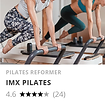
The increasing number of boutique fitness studios and independent instructors that offers new specialized classes led to developing a new service - a "marketplace" for fitness classes from various studios and instructors. I was asked to design this mobile platform based on the existing software and adapting it to the needs of the new users.
02
keep energy up
Goals
Develop a convenient platform to browse and book different classes.
Plan a showcase for individual studios and instructors brands.
Include an advanced search option using filters.
Design an interface that will appeal to both potential users and instructors.
Form a clean and simple appearance that won't overshadow the content.
03
plan a routine

Idea to Plan
Knowing users needs and the challenges they face is integral to creating useful and desirable products.
To establish the features needed for the design of the new platform, an analysis of usage metrics was undertaken in addition to usability tests of the current software. Although they are not meant for the same target audience, they share common features and characteristics.
In addition, designing wireframes at an early stage, helped me identify the proper flow and hierarchical layers, making it easier for users to find the information. That was an important stage in the project that ensured achieving a deeper understanding through combining both qualitative and quantitative information while revealing what existing features are used often and the common action sequences.
Millennials are abandoning their gym memberships for more expensive and trendy boutique fitness classes that reflect their
individuality and unique identity
specialized
experiences, a sense of community, and flexible participation.
and offer more
04
work hard to make it easy
Simple & Intuitive
CHALLENGE
Facing a large amount of choice might be complex and confusing, thus it is important to keep the design in its simplest form and make it intuitively interactive with minimal learning.
SOLUTION
The vast amount of details required to appear in the app, forced me to edit and rearrange it in a clear and appealing way, whilst standardizing and maintaining the hierarchy of the information display.
Analysis of users' operational behavior during the study, revealed their expectations of carrying out actions in more than one way.
For example, I planned the possibility to register for a class directly from the lesson list, from the lesson page itself and by right-sliding the requested lesson. Furthermore, I learned that users develop a sense of commitment and bonding with the product by discovering the shortcuts and functions, as long as they stay familiar and consistent.
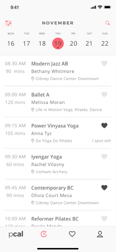
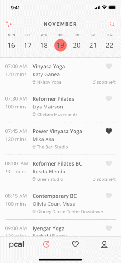
All major features are easy to access from the lower tab bar. In order to provide best user experience, the screen is designed to help users view and search data in a simple and intuitive way.
05
once you see results
Advanced Search
CHALLENGE
The convenience of using a single platform to browse and book different classes in various locations is very appealing. However, the process of looking for the right classes can feel long and frustrating when there are too many steps to reach a specific goal.
SOLUTION
With many activities to choose from, having a convenient and clear searching function is a crucial feature.
Using the map, users can be exposed to new activities they might otherwise have not encountered or knew were available in their area. If the user already knows what they are looking for, they can filter by specific parameters or just see what's out there that will pique their interest. In addition, users can save their search properties by time and location preferences.
06
feel good, look good
User Interface

CHALLENGE
As I started the project, the client presented the company's business strategy and the design characteristics needed to support it. I was asked to design the app based on the identity and structure of their existing products with adjustments to match the target audience.
SOLUTION
The design process focused on modifying the brand identity to the target audience without losing its core visual values. To this end, I enlisted the help of a focus group, whose insights helped guide the process and ensure I was best prepared to successfully complete the task.
For the new user interface, I preserved essential visual elements, like the main layout and the typography and reconstructed them in the new visual language with some minor amendments. I created additional original icons that corresponded with the general style that intended to accomplish informative and navigational functions. While maintaining the shades of gray as secondary colors, the main color in the palette was replaced from navy blue to a pinkish-red that according to the focus group transmits youth, innovation and energy. The home page was designed to grant easy access and personalized recommendations according to the users activity.
07
outcome
App Screens


08
conclusions
Final Thoughts
The final design of the app was validated after the third iteration. In the last user testing, the participants experienced less confusion and hesitations while going through the registration process, which resulted in a quicker and seamless booking process. They were able to quickly use the filters to narrow down their classes.
In less than 6 weeks, together with the client and its team, we succeed to complete the development of this app. I believe we achieved all our goals and even managed to set new ones for the next version of the app (like socials features and a potential store).
Design is not just about making things look visually appealing- It’s a tool to help communicate effectively and create a better product experience. This is a key component to cultivating a long-lasting relationship with your users.
We often think we know what we want to solve, but research and surveys will help understand that there are both broad and specific aspects to users experiences. That is the essence of user-centered design and this project is an excellent example of that.
bottom of page